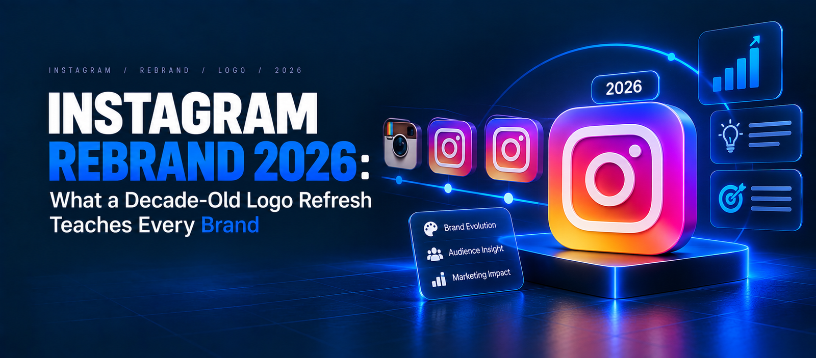
Instagram Rebrand 2026: What a Decade-Old Logo Refresh Teaches Every Brand
Instagram refreshed its wordmark on August 13, 2026 — its first update in about a decade. The camera icon stayed, three new typefaces arrived, and users mocked a stylized "r" as "Instagzam." The lesson: evolve, don't erase; test legibility; and expect backlash to fade faster than recognition does.
One letter. That is all it took to turn the Instagram rebrand 2026 into a meme.
On August 13, 2026, Instagram head Adam Mosseri unveiled a new wordmark for an app used by more than 3 billion monthly active users (a milestone Meta announced in September 2025, per CNBC). Within hours, his announcement posts had collected over 5,000 combined replies, according to Social Media Today — and a big chunk of them were reading the logo as "Instagzam."
So was this a branding misstep or a smart, low-risk evolution? The honest answer is: a bit of both. And that is exactly why it is worth studying.
1. What Actually Changed in the Instagram Rebrand 2026?
Before judging the reaction, it helps to be precise about the change. Instagram did not tear down its identity — it updated the wordmark (the written "Instagram" logotype) and expanded its wider brand system. Most of what users see every day, including the camera icon on their home screen, stayed put.
The Wordmark Got Bolder and Simpler
Mosseri explained the reasoning plainly: "We updated the Instagram wordmark today, which is more than a decade old and felt dated. We feel the refresh is sharper and more modern, but references the original and has the simplicity and craft that's always made it Instagram" (as quoted by Social Media Today).
According to Meta's Design at Meta blog, the team explored "hundreds of directions," including all-caps and camera-based concepts, before returning to a crafted script. Jasmine Probst, Director of Product Design at Instagram, said: "Script reflects individuality, so referencing that felt right. The new wordmark is bolder and simpler, with touches of unexpectedness."
A Full Type Family and a Quieter Gradient
The refresh also introduced three typefaces:
- Instagram Sans (updated)
- Instagram Pen (a new handwriting typeface)
- Instagram Mono (a new monospaced face)
Meta says the signature gradient remains, but will be used more subtly so community content takes center stage. The rollout continues through 2026 and beyond.
Mini case study: Compare this with Instagram's own 2016 update, when it swapped its skeuomorphic brown camera for the flat gradient icon. That change was a true overhaul. The 2026 move is deliberately smaller — a sign Instagram learned that recognition is an asset you spend carefully.
Pro Tip: Before any redesign, list your brand assets in order of recognition (icon, color, wordmark, tagline). Change the least-recognized assets first and protect the top one.
*Planning your own brand update? Keep reading for the exact process.*
2. Why Did the Instagram Rebrand Get a Mixed Reaction?
Backlash to logo changes is almost a law of nature, because people bond with what is familiar. But the specific complaints about Instagram reveal two distinct problems that any brand can learn from: one about legibility, and one about priorities.
Is the New Instagram Logo Hard to Read?
This was the loudest complaint. The stylized "r" reminded many users of a "z," spawning "Instagzam" and "Instagwam" jokes across Threads and X. When a wordmark invites misreading, the joke can travel further than the design itself.
That said, several observers noted that Instagram's recognition is so strong that most people still read the name instantly. A 3-billion-user brand can absorb quirkiness that a new startup cannot.
Why Were Users Asking for Feed Fixes Instead?
The second theme in the replies, per Social Media Today, was frustration that Instagram was polishing fonts while users wanted algorithm and feed improvements. This is the perception-of-priorities trap: when customers have unresolved pain points, any cosmetic change can look tone-deaf.
Mini case study: Gap learned this the hard way in October 2010, when it replaced its classic blue-box logo with a Helvetica wordmark. After intense online backlash, Gap reverted to the original logo within about a week. Instagram's refresh is far milder, but the pattern is the same — audiences react to *what a change signals*, not only to how it looks.
Pro Tip: Pair any visual refresh with a product or customer-experience improvement in the same announcement, so the story is "we're getting better," not "we changed our font."
*Want to see how authenticity shapes brand perception? Read our guide on authentic brand campaigns in 2026.*
3. Brand Refresh vs Rebrand: Which One Does Your Business Need?
Instagram chose a brand refresh — an evolution of existing assets — rather than a full rebrand. Understanding the difference matters, because the risk and cost profiles are very different. The wrong choice can erase years of brand equity overnight.
How Do a Refresh and a Rebrand Compare?
| Factor | Brand Refresh (Instagram 2026) | Full Rebrand (Gap 2010 / Tropicana 2009) |
|---|---|---|
| Scope | Wordmark, type, color usage | Logo, packaging, identity, sometimes name |
| Recognition risk | Low to moderate | High |
| Cost | Lower | Higher |
| Best for | Dated visuals, stable positioning | New market, merger, broken reputation |
| Typical backlash | Short-lived jokes | Sales impact, reversals |
What Happens When a Rebrand Goes Too Far?
The cautionary tale is Tropicana. In January 2009, the brand replaced its iconic orange-with-a-straw packaging with a minimalist design. According to widely cited coverage summarized by The Branding Journal, sales fell about 20%, an estimated loss of roughly $30 million, and Tropicana announced a return to the old packaging by late February 2009. Shoppers literally could not find the product on shelves.
Instagram avoided this by keeping its most recognizable asset — the camera icon — untouched.
Pro Tip: If customers find you visually (on shelves, app grids, or search results), never change your primary recognition asset and your secondary assets at the same time.
*Tracking brand perception through trends? See our breakdown of nostalgia branding trends in 2026.*
4. How to Refresh Your Logo Without Losing Recognition
The good news: you can capture the upside of a refresh while minimizing the backlash. The Instagram rebrand 2026 offers a practical blueprint — and its stumbles show where to add guardrails. Consistency is the goal, because research from Lucidpress (now Marq) has associated consistent brand presentation with revenue increases of up to 23% (a survey-based figure worth checking against the original report).
The 7-Step Logo Refresh Process
- Audit your equity. Survey customers on which assets they recognize most (icon, color, name, typeface).
- Define the "why." Write one sentence explaining the change, as Mosseri did ("felt dated").
- Explore widely, then return to your roots. Instagram tested hundreds of directions before choosing an evolved script.
- Stress-test legibility. Show the wordmark at small sizes and to people who have never seen it. Ask them to read it aloud — this catches "Instagzam" problems early.
- Protect your anchor asset. Keep the single most-recognized element unchanged.
- Build a system, not just a logo. Instagram shipped three typefaces and gradient rules alongside the wordmark.
- Launch with a story and a benefit. Pair the visual update with something customers actually want.
What Should You Do After Launch?
Monitor sentiment for 30 to 60 days, but do not panic at day-one jokes. Separate *legibility* complaints (fixable) from *taste* complaints (usually temporary). Also update every touchpoint at once — social avatars, favicons, email signatures, and ad creatives — so mixed versions do not dilute recognition. If you run paid campaigns, refresh ad creative in phases and watch click-through rates, just as you would during Meta ads creative updates in 2026.
Mini case study: Instagram's measured rollout "through 2026 and beyond," as Meta describes it, gives users time to adjust rather than forcing an overnight switch.
Pro Tip: Run a "read it aloud" test with 10 people outside your company before finalizing any stylized lettering. If two or more misread it, revisit the letterforms.
*Need help planning a brand refresh that keeps your SEO and social equity intact? Talk to the Cross Globe Marketing team.*
5. What Does the Instagram Rebrand Mean for Marketers and Creators?
For most businesses, the Instagram wordmark change is low-impact operationally — but it is a useful prompt to clean up your own brand assets. The bigger signal is strategic: platforms are increasingly putting community content ahead of their own visual branding.
Do You Need to Update Your Marketing Materials?
If your website, email footers, or print collateral show the Instagram wordmark, plan to swap in the new version as official assets become available through Meta's brand resources. Social icons using the camera glyph are likely unaffected, since the icon did not change.
What Is the Bigger Lesson for Content Strategy?
Instagram's quieter gradient mirrors a wider shift toward content-first design. For creators and brands, that means your visuals — not the platform's — should do the heavy lifting. This connects to broader platform transparency moves too, such as TikTok's AI labeling rules.
Pro Tip: Use this moment to audit every place your own social handles and icons appear. Outdated logos across touchpoints quietly erode trust.
*Want a full brand-consistency audit across web, social, and email? Cross Globe Marketing can help.*
Summary
The Instagram rebrand 2026 is not a failure, and it is not a flawless win either. It is a textbook brand refresh: protect the icon people love, modernize the wordmark, build a richer type system — and then accept that one quirky letter can dominate the conversation for a week. The real takeaway for founders and marketers is that recognition is earned over years and lost in days, so every change should be evolutionary, tested, and paired with a benefit customers can feel.
Key Takeaways
- Instagram unveiled its first wordmark refresh in about a decade on August 13, 2026 (Social Media Today; Meta Design blog).
- Mosseri's announcement drew 5,000+ combined replies, with many mocking the "Instagzam" letterform (Social Media Today).
- Instagram serves over 3 billion monthly active users, giving it unusual room to absorb backlash (CNBC, September 2025).
- Tropicana's 2009 packaging overhaul saw sales fall about 20%, roughly $30 million, before reversal (The Branding Journal).
- Gap reverted its 2010 logo redesign within about a week after public backlash (widely reported).
- Consistent brand presentation has been linked to revenue gains of up to 23% (Lucidpress/Marq research).
Ready to refresh your brand without losing the recognition you have built? Contact Cross Globe Marketing today for a brand and SEO audit that protects your equity while you evolve.
Quick Summary
The Instagram rebrand 2026 was a wordmark refresh announced by Adam Mosseri on August 13, 2026 — the first in about a decade — that kept the camera icon, added Instagram Sans, Instagram Pen, and Instagram Mono typefaces, and used the gradient more subtly. The reaction was mixed, with 5,000+ replies and widespread "Instagzam" jokes about a stylized "r," plus requests for feed fixes over cosmetic changes. Compared with Tropicana's 2009 packaging failure and Gap's 2010 logo reversal, Instagram's evolutionary approach shows that protecting your most recognized asset, testing legibility, and pairing changes with customer benefits are the core rules of a safe logo refresh.